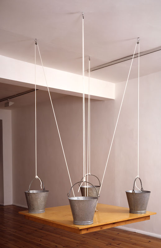
Michael Craig-Martin was the most playful and provocative of the conceptual artists. His early sculptures are like visual puns, a play on the laws of nature. On the Table, 1970 (pictured below right), for instance, appears to defy gravity. Four buckets filled with water stand on a table; so far so ordinary. But the table has no legs and is suspended from the ceiling by ropes and pulleys.
Normal relationships are reversed; by acting as a counter balance, the buckets hold up the table rather than the other way round. On the Shelf, 1970, consists of 15 milk bottles lined up on a shelf tilted at a crazy angle; the bottles are filled with different amounts of water, creating a horizontal line that compensates for the tilt and makes everything appear level.
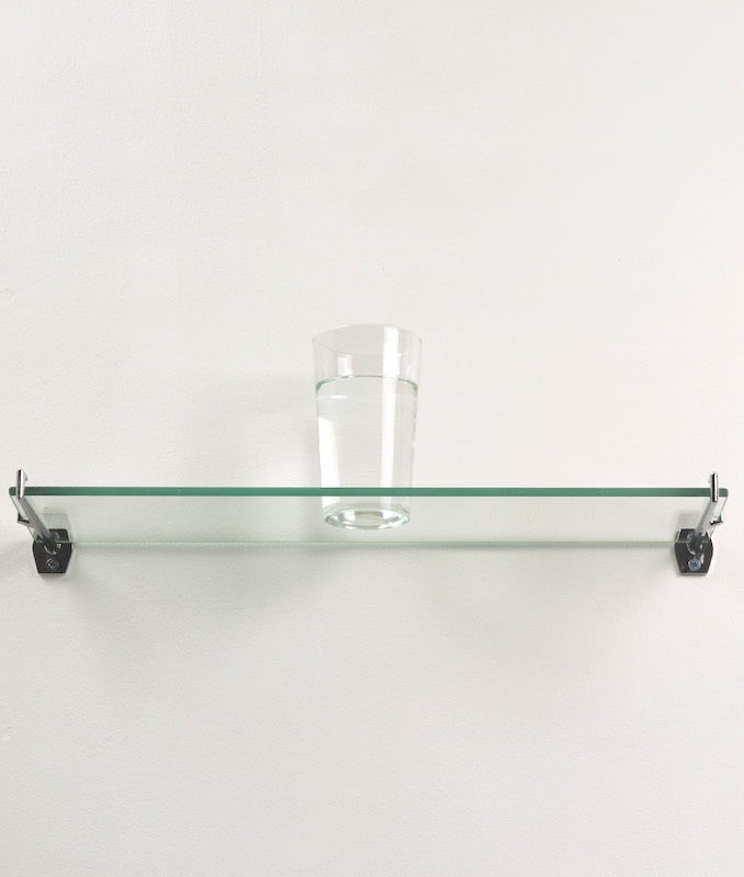
 In 1974 he upped the ante by exhibiting a glass of water on a glass shelf, titling it An Oak Tree and claiming that, although it was still a glass of water, it had been transformed into a tree (pictured below left). It caused a furore and I remember my brain scrambling to accommodate the conflicting realities, and enjoying the paradox.
Many dismissed the idea as a silly prank when, in fact, it was a serious exploration of the power of the imagination. The poet Samuel Taylor Coleridge used the phrase “the suspension of disbelief” to describe the need to see beyond bare facts when engaging with a poem or work of art. Without it a painting is nothing more than a flat surface daubed with colour and a sculpture a lump or an assemblage of stuff. As a Catholic, Craig-Martin was brought up to believe in the transformation of wine into the blood of Christ, so why should a glass of water not also be transformed? All that’s needed is a leap of faith.
Questioning the very nature and purpose of art, An Oak Tree felt like the ultimate challenge. A few years later, though, Craig-Martin began demonstrating the power of art to conjure objects with minimal means. Outline drawings of familiar things like safety pins, corkscrews, fans, forks and light bulbs which he described as “so famous we don’t even notice them” were made in black ink. Soon he shifted to electronic circuitry tape which gives a crisp uniformity of line that echoes the mass production of the items portrayed. He also made sculptures and reliefs. The silhouette of a high heeled shoe strides across the Royal Academy's courtyard, for instance, while indoors a fountain pen outlined in steel draws a steel line across the wall. It’s a delight, as are his see-through still lives in which clusters of mundane objects are overlaid in elegant clutter to attain a ghostly charisma.
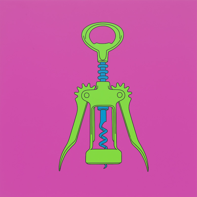
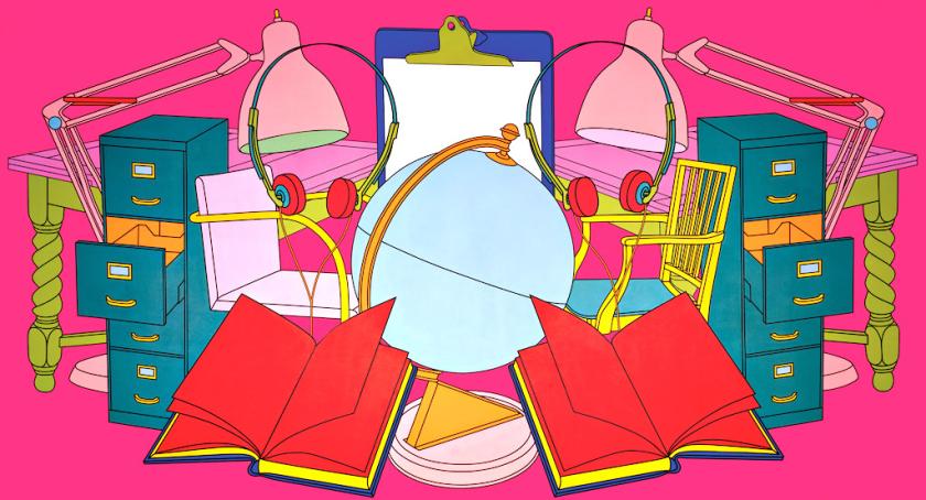
 From the mid-1990s he filled the silhouettes with bright colours laid on flat to create an almost industrial finish (pictured below right: Untitled: corkscrew). Common History: Conference, 1999 (main picture) was first commissioned as the backdrop to a conference whose international remit is reflected by the globe at the centre of a symmetrical array of items associated with meetings and bureaucrats. The candy colours create a false sense of gaiety at odds with the dry subject matter.
That same year he began reproducing famous artworks in the same style. And this is where I lose patience. Reduced to black silhouettes filled with flat bright colours, Manet’s Olympia and Velasquez’s Las Meninas are reduced to crude parodies, all subtlety, texture and nuance lost. The series feels more like an insult than an act of homage.
Despite its red outline and eyebrows and contrasting green face, Craig-Martin’s self portrait of 2007 is surprisingly recognisable. But why reduce oneself to a cypher? The following year, architect Zaha Hadid got the same treatment. As though to compensate for robbing her of any sign of character and humanity, a computer programme continuously alters the lurid colouring of the digital portrait. It’s a diversion that fails to give this dead likeness any semblance of vitality or to hide its paucity of feeling and empathy.
 Cosmos is installed in the last gallery; instead of the universe of stars suggested by the title, the heavens are filled with mundane objects. Floating weightlessly in their hundreds across the black walls are Craig-Martin’s signature drawings of mass produced items. Despite the bright colours and elegant drawing, no gaiety accompanies the hoard. The display is as soulless and depressing as if all living things had been banished from the world, leaving only the stuff we’ve manufactured to fill the void. Here comes a balloon but no party, a high chair but no toddler, a toaster with no bread, a mousetrap but no mouse, a garden fork but no soil and an umbrella with no rain. It’s as if the ether had been colonised by the contents of a giant waste tip – a reminder that we’re choking the planet with unwanted crap.





Add comment