When Forms Come Alive, Hayward Gallery review - how to reduce good art to family fun | reviews, news & interviews
When Forms Come Alive, Hayward Gallery review - how to reduce good art to family fun
When Forms Come Alive, Hayward Gallery review - how to reduce good art to family fun
Seriously good sculptures presented as little more than playthings or jokes

Under the guidance of director Ralph Rugoff, the Hayward Gallery seems hell bent on reducing art to the level of fun for all the family. And as though to prove the point, cretinous captions strip the work of all meaning beyond the banal, while press pictures showcase kids gazing at large sculptures.
Their latest exhibition, When Forms Come Alive consists of sculptures by 21 artists, all of whom employ organic rather than geometric forms. “Dynamic, exuberant and playful, the works in this show, take visitors on an adventure into a world of fascinating forms,” says Rugoff.
 The “adventure” begins in the project space, which is filled with Pumping, an installation by Spanish artist Eva Fábregas of bright pink inflated tubes resembling a tangle of giant intestines with an 8 channel soundtrack of dance music. The piece is reminiscent of an immersive kids’ play space, but you aren’t allowed to jump on the tubes, so in terms of “adventure” a bubble room or bouncy castle would have been more satisfying.
And there’s the rub; most kids like to explore things physically – to touch, climb, yell, run and scream – all of which, thankfully, are still taboo in galleries. So if you present sculpture as little more than a sensory experience bereft of further meaning, you do artists and viewers a grave disservice.
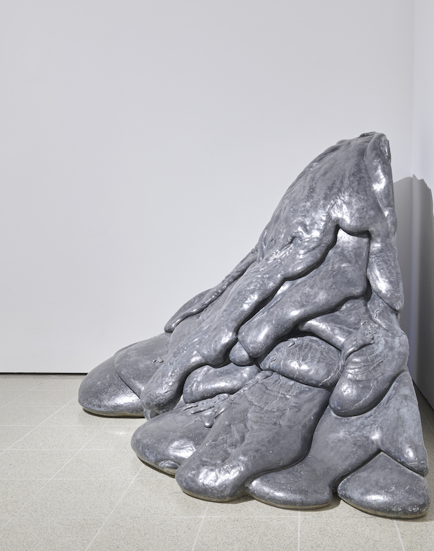
The exhibition contains some first rate art, but you’d be hard pressed to see it as such. Take Lynda Benglis’s Quartered Meteor 1969 (pictured above right), for example. Slumped in the corner of an upstairs room is a heap of grey matter resembling congealed lava. There’s something compellingly about this flaccid lump of inertia; its shape seems to have arisen naturally – from the way molten lead (from which it is made) flows, flops and solidifies when cooling. The caption quotes the artist as saying “I like things that flow” and implies that there’s nothing else to know – which is to miss the point entirely.
 Benglis first made the piece in brightly coloured polyurethane, chosen for its lack of fine art credentials. The anti-heroic shape was a riposte to the minimalist art filling New York’s galleries at the time. In the male-dominated art world of the 1960s, so-called rational geometry was king while sagging forms perceived as feminine were taboo. Using droopy shapes that succumb to gravity was, therefore, a political act. And it gets more complicated; the form of this lead version may appear natural when, actually, it’s a cast of the polyurethane original. Rather than highlighting how molten lead behaves, the artist’s main aim was to subvert a perceived hierarchy of forms and to overlook that is to completely misrepresent the work.
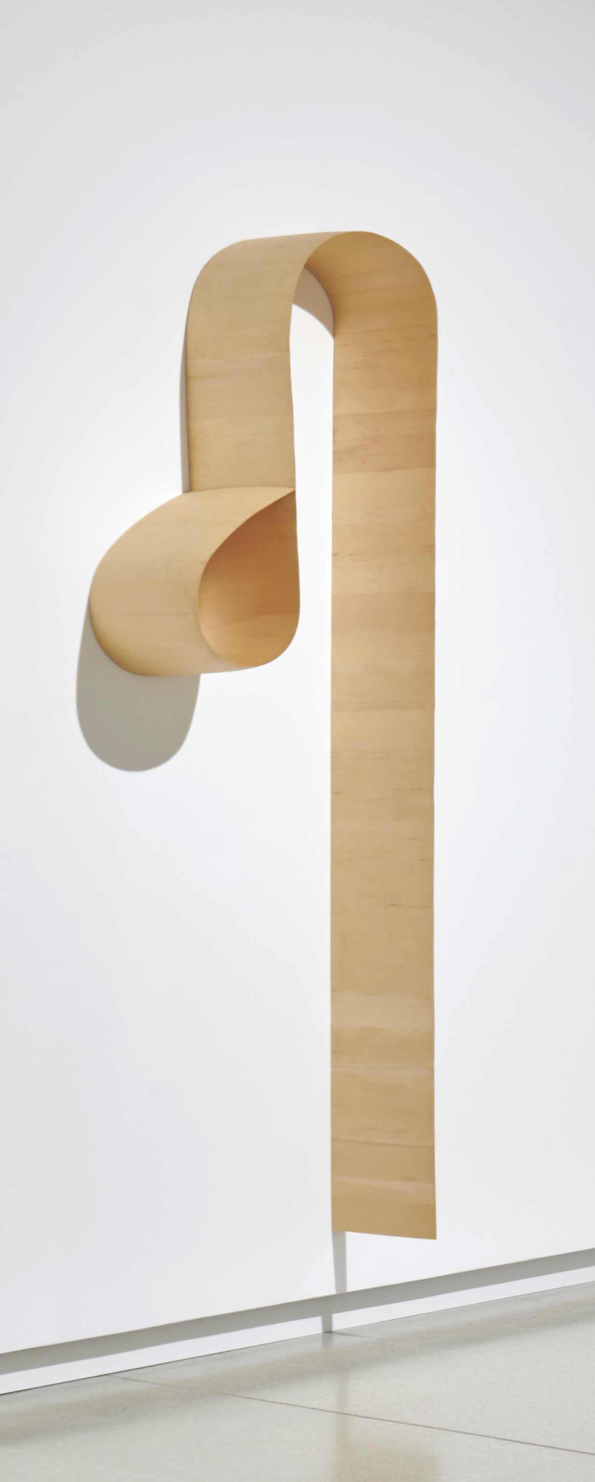
There are sculptures, of course, that don’t benefit from explanation – that are so self-evident they make words irrelevant. Made from Alaskan yellow cedar, Martin Puryear’s Untitled (2013) (pictured left) traces a slender arc down the wall that is so perfect it silences speech. And Shylight (2006-14) (main picture) by DRIFT (Lonneke Gordijn and Ralph Nauta) is another delight. A shoal of lights descends from the ceiling, then wafts back up again in a choreographed sequence. Dressed in white frills that open and close like tiny umbrellas, they are reminiscent of jelly fish navigating the ocean depths.
Most works, though, are enriched by explanation. The caption says that Senga Nengudi’s RSVP Reverie ‘D’ (2014) “relates to the human body”, without saying how or why. But it helps to know that Nengudi began using tights in her work when she was pregnant – to reflect the strain on the mother’s body as it expands to accommodate the growing foetus. “The body,” she says, “can only stand so much push and pull until it gives way, never to resume its original shape.” As an African American, she chooses colours ranging from black to tan to refer to women of all races. Pinned to the wall in configurations that stretch them to their limits, the tights create dynamic lines of tension while, filled with sand, the toes anchor them to the floor.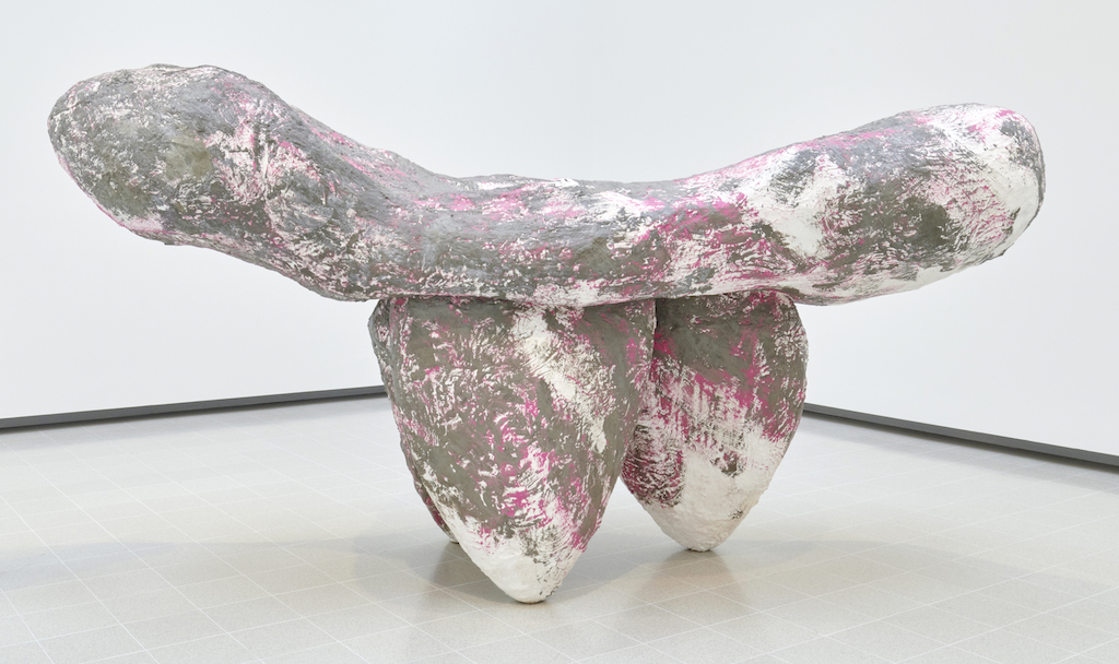 Phyllida Barlow’s wry humour is extremely subtle. Her monumental Untitled: modern sculpture; 2022 (2022) (pictured above) is an ironic response to the self-important public sculptures jokingly referred to by Tom Wolfe as “the turd in the plaza”. The work’s awkward shapes and scuzzy surface are a knowing riposte to Henry Moore’s gleaming bronzes, so loved by rich corporations.
To fully appreciate Franz West’s sculptures, similarly, it helps to know the context in which he worked. His irreverence was a reaction to the Viennese Actionists who, under the mantra “art is politics”, created performances that were violent demonstrations of rage and angst. Made of cheap materials like papier maché and polystyrene, West’s sculptures are deliberately tacky and absurd. In Cain Approaching Abel 2009 (pictured below), for instance, he portrays the Old Testament brothers as posturing and incompetent boxers, their sibling rivalry embodied in knobbly erections.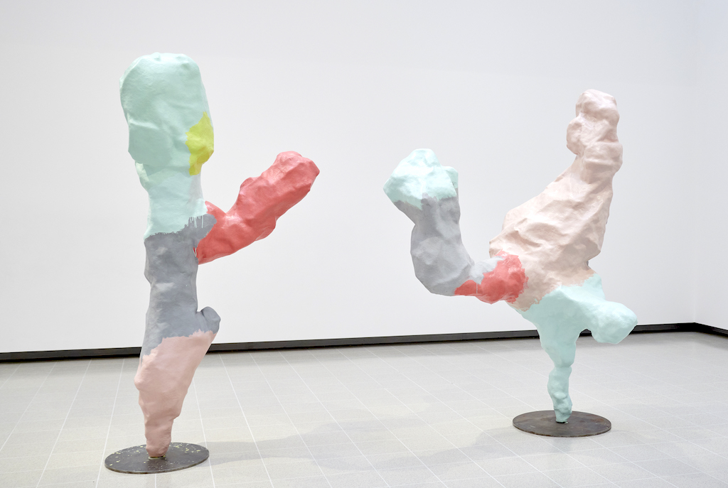 The caption refers to the work as slapstick, which reduces it to little more than a daft joke. This kind of dumbing down simply doesn’t work; art is rarely designed merely to entertain so trying to force it to be amusing inevitably leads to failure.
When Forms Come Alive includes some great works, but with this banal approach, the Hayward does its utmost to kill them off.
- When Forms Come Alive at the Hayward Gallery to May 6
- More visual arts reviews on theartsdesk
rating
Explore topics
Share this article
The future of Arts Journalism
You can stop theartsdesk.com closing!
We urgently need financing to survive. Our fundraising drive has thus far raised £49,000 but we need to reach £100,000 or we will be forced to close. Please contribute here: https://gofund.me/c3f6033d
And if you can forward this information to anyone who might assist, we’d be grateful.

Subscribe to theartsdesk.com
Thank you for continuing to read our work on theartsdesk.com. For unlimited access to every article in its entirety, including our archive of more than 15,000 pieces, we're asking for £5 per month or £40 per year. We feel it's a very good deal, and hope you do too.
To take a subscription now simply click here.
And if you're looking for that extra gift for a friend or family member, why not treat them to a theartsdesk.com gift subscription?
more Visual arts
 'We are bowled over!' Thank you for your messages of love and support
Much-appreciated words of commendation from readers and the cultural community
 Lee Miller, Tate Britain review - an extraordinary career that remains an enigma
Fashion photographer, artist or war reporter; will the real Lee Miller please step forward?
 Kerry James Marshall: The Histories, Royal Academy review - a triumphant celebration of blackness
Room after room of glorious paintings
 Folkestone Triennial 2025 - landscape, seascape, art lovers' escape
Locally rooted festival brings home many but not all global concerns
 Sir Brian Clarke (1953-2025) - a personal tribute
Remembering an artist with a gift for the transcendent
 Emily Kam Kngwarray, Tate Modern review - glimpses of another world
Pictures that are an affirmation of belonging
 Kiefer / Van Gogh, Royal Academy review - a pairing of opposites
Small scale intensity meets large scale melodrama
 Jenny Saville: The Anatomy of Painting, National Portrait Gallery review - a protégé losing her way
A brilliant painter in search of a worthwhile subject
 Abstract Erotic, Courtauld Gallery review - sculpture that is sensuous, funny and subversive
Testing the boundaries of good taste, and winning
 Edward Burra, Tate Britain review - watercolour made mainstream
Social satire with a nasty bite
 Ithell Colquhoun, Tate Britain review - revelations of a weird and wonderful world
Emanations from the unconscious
 Rachel Jones: Gated Canyons, Dulwich Picture Gallery review - teeth with a real bite
Mouths have never looked so good

Add comment