Phyllida Barlow: Dock, Tate Britain | reviews, news & interviews
Phyllida Barlow: Dock, Tate Britain
Phyllida Barlow: Dock, Tate Britain
A joyous celebration of ad hoc creativity fills the Duveen Galleries

The revamping of Tate Britain has produced such an atmosphere of understated elegance that one hardly dares breathe for fear of displacing a particle of dust. An air of suffocating sterility has seeped into the displays, which are so tastefully arranged that even the most passionate works are drained of emotion; and without a ripple of feeling ruffling the exquisite calm of these genteel waters, British art appears unrelentingly polite – and provincial.
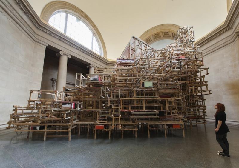
Thank heavens for Phyllida Barlow who manages, single-handedly, to energise the space by filling the Duveen galleries with an installation that is riotously impolite, determinedly crude and magnificently potent. Dock refers as much to industrial architecture, piers, bridges and shipping containers as to the history of sculpture. Yet with slick fabrication techniques and hi-tech gizmos noticeably absent, it is highly traditional – in the best possible sense.
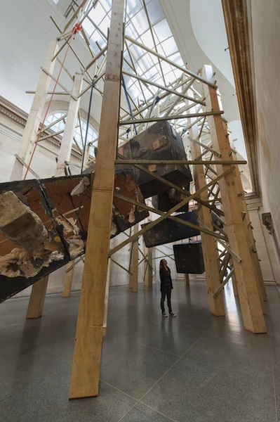
 From 20 wooden piers hang five large containers darkened to resemble steel (pictured right). They look heavy, inert and potentially lethal, but they’ve been attacked by a battering ram. Furthest from the entrance hangs a specimen so badly damaged that its guts are exposed; this reveals nothing more substantial than layers of flimsy polystyrene attached to a steel frame by dozens of plastic ties. The battering ram turns out to be nothing more than a length of polystyrene darkened to look weighty and dangerous. This is pure theatre – film set bravado – deliciously-tuned to mock the macho heroics indulged in by heavy-metal sculptors such as American artist Richard Serra.
The exhibition spiel describes how the materials have been “suspended, collapsed, stacked, wrapped, folded and jammed”. It brings to mind a list famously compiled by Serra in 1967, citing actions that might produce sculptures: “to roll, to crease, to fold, to store....to support, to hook, to suspend, to spread, to hang”. They provide a remarkably apt description of Barlow’s working methods and there’s no doubt that the making process is as important to her as the end result. It's impossible to imagine her employing hundreds of assistants in a factory style set-up more like a production line than a studio.
Serra became famous in the 1970s for sculptures made from sheets of corten steel precariously balanced in unstable configurations that threatened to crush anyone venturing too close. His installations have since become larger and more bombastic, but health and safety regs demand that the steel be fixed so the threat is imaginary rather than actual. In 1992 Serra was invited, like Barlow, to occupy the Duveen Galleries and he installed two heavy-duty steel blocks in the north and south rooms respectively. In Barlow’s installation it looks a though his boxes have multiplied, levitated and been exposed as a sham.
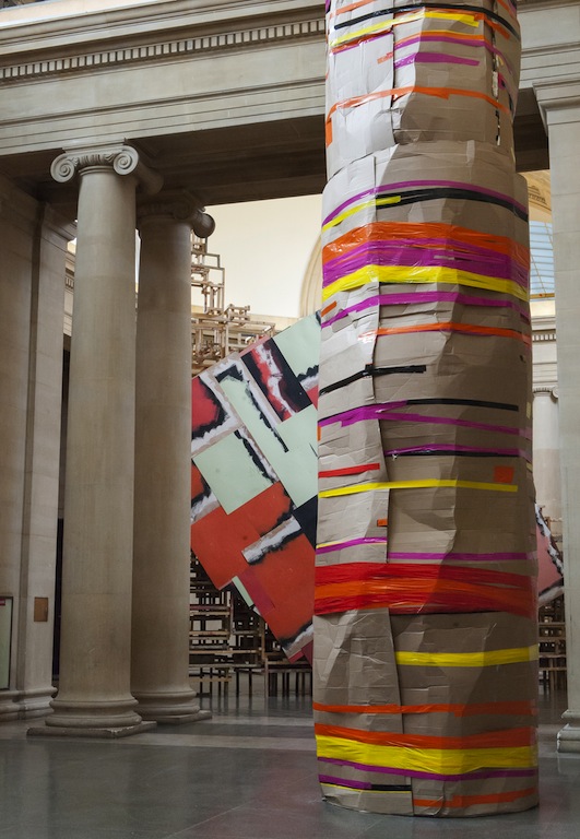
 Her exhibition is more than simply a response to Serra, though; she is poking gentle fun at all macho pretensions and overblown erections. Crushedtower is a wobbly cylinder of battered cardboard held together with expanding foam and gaffer tape (pictured left); it reaches toward the vaulted ceiling, but its lofty ambitions are compromised by crumpled imperfection.
Filling the octagon Emptystaircase/hoarding is an unruly grid of 2 x 4” resembling the backside of a billboard or the underside of a football terrace. It supports a wall of plywood offcuts that look as if they were used to protect a floor, while inept decorators splashed pale green, black and orange paint around the place. As much emphasis is given to the support structure as the hoarding which, in any case, advertises nothing more glamorous than DIY ineptitude. In a society obsessed by glossy facades and physical perfection, the suggestion that slipshod efforts are more interesting than flashy veneers is refreshing in the extreme.
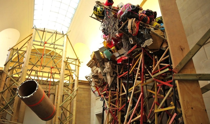
Occupying the north gallery are two huge wooden structures resembling piers; from one dangles a large cylinder that could be a section of sewer pipe (pictured below), if it weren’t made of bent ply. From the other hangs a sagging sausage of upholstery sponge draped with lengths of canvas and carpet underlay. And as though various sculptural options have been tried and then discarded, a honeycomb of plaster-splattered scrim nestles above two shapes resembling heraldic shields awaiting adornment.
 Nearby, five tall gantries (pictured above) of the kind a marauding army might use to scale castle walls stand ready for use, but their mobility is impaired by a mass of studio detritus. The tops are festooned with tangles of rope and electrical cable, rolls of canvas and underlay and bin liners stuffed with cardboard tubes or polystyrene offcuts. Orange and red gaffer tape creates a festive air though what is being celebrated, beyond creativity itself, is a mystery.
A huge pile of junk has been left beside the door as though awaiting collection. Yet the apparent chaos is carefully orchestrated: bits of wood and rolls of tarpaulin are coloured pink, ochre, orange or green to give harmony to this jumble of discarded material.
This is art on a grand scale – work with huge ambition, but no pretension, where self-deprecating humour replaces pompous bluster. Funny, uplifting and life enhancing, it makes the declamatory bombast that peppers the history of sculpture seem foolishly narcissistic. What a joy!
- Phyllida Barlow: Dock at Tate Britain until 19 October
Over the page: watch Phyllida Barlow talk about her installation
Explore topics
Share this article
Add comment
The future of Arts Journalism
You can stop theartsdesk.com closing!
We urgently need financing to survive. Our fundraising drive has thus far raised £49,000 but we need to reach £100,000 or we will be forced to close. Please contribute here: https://gofund.me/c3f6033d
And if you can forward this information to anyone who might assist, we’d be grateful.

Subscribe to theartsdesk.com
Thank you for continuing to read our work on theartsdesk.com. For unlimited access to every article in its entirety, including our archive of more than 15,000 pieces, we're asking for £5 per month or £40 per year. We feel it's a very good deal, and hope you do too.
To take a subscription now simply click here.
And if you're looking for that extra gift for a friend or family member, why not treat them to a theartsdesk.com gift subscription?
more Visual arts
 'We are bowled over!' Thank you for your messages of love and support
Much-appreciated words of commendation from readers and the cultural community
 Photo Oxford 2025 review - photography all over the town
At last, a UK festival that takes photography seriously
![SEX MONEY RACE RELIGION [2016] by Gilbert and George. Installation shot of Gilbert & George 21ST CENTURY PICTURES Hayward Gallery](https://theartsdesk.com/sites/default/files/styles/thumbnail/public/mastimages/Gilbert%20%26%20George_%2021ST%20CENTURY%20PICTURES.%20SEX%20MONEY%20RACE%20RELIGION%20%5B2016%5D.%20Photo_%20Mark%20Blower.%20Courtesy%20of%20the%20Gilbert%20%26%20George%20and%20the%20Hayward%20Gallery._0.jpg?itok=7tVsLyR-) Gilbert & George, 21st Century Pictures, Hayward Gallery review - brash, bright and not so beautiful
The couple's coloured photomontages shout louder than ever, causing sensory overload
Gilbert & George, 21st Century Pictures, Hayward Gallery review - brash, bright and not so beautiful
The couple's coloured photomontages shout louder than ever, causing sensory overload
 Lee Miller, Tate Britain review - an extraordinary career that remains an enigma
Fashion photographer, artist or war reporter; will the real Lee Miller please step forward?
 Kerry James Marshall: The Histories, Royal Academy review - a triumphant celebration of blackness
Room after room of glorious paintings
 Folkestone Triennial 2025 - landscape, seascape, art lovers' escape
Locally rooted festival brings home many but not all global concerns
 Sir Brian Clarke (1953-2025) - a personal tribute
Remembering an artist with a gift for the transcendent
 Emily Kam Kngwarray, Tate Modern review - glimpses of another world
Pictures that are an affirmation of belonging
 Kiefer / Van Gogh, Royal Academy review - a pairing of opposites
Small scale intensity meets large scale melodrama
 Jenny Saville: The Anatomy of Painting, National Portrait Gallery review - a protégé losing her way
A brilliant painter in search of a worthwhile subject
 Abstract Erotic, Courtauld Gallery review - sculpture that is sensuous, funny and subversive
Testing the boundaries of good taste, and winning
 Edward Burra, Tate Britain review - watercolour made mainstream
Social satire with a nasty bite

Comments
Like Sarah Kent, I also