The Exhibition Road Quarter review, V&A - an intelligent and much needed expansion | reviews, news & interviews
The Exhibition Road Quarter review, V&A - an intelligent and much needed expansion
The Exhibition Road Quarter review, V&A - an intelligent and much needed expansion
One of the country's great museums gets a makeover

Oh those Victorians! Hail Prince Albert whose far-sighted ambition led to Albertopolis, embracing museums, galleries, universities and the Royal Albert Hall.
In its largest building project since 1909, the museum continues to enhance, expand and change to meet different demands: demands from visitors, and demands from the objects themselves for ever higher standards of preservation, scholarship, conservation and display. A huge new development on Exhibition Road – dubbed the Exhibition Quarter – long in the planning and six years in the building, opened to the public on 30 June, designed by Amanda Levete’s architectural firm, in collaboration with Arup engineering, Wates construction, and other specialists. It is just the most visible part of the V&A’s long running Future Plan, marked by a week-long free festival of umpteen events, called "Reveal".
 And what do you get? Well, really big bangs for your buck with much behind the scenes. There's an enormous new exhibition space in what was a basement, last used from 1981-1986 for the Conran Foundation-financed design exhibitions that preceded the Design Museum. Behind the scenes are spaces for storage, conservation and preparation, a loading bay for the whole museum (geared to the size of a maharaja’s Rolls Royce – you couldn’t make it up) and for access for each bespoke special exhibition. At last the V&A will have a specially created space for temporary shows, no longer reliant for its spectaculars (think McQueen, Bowie) on the continual recycling of the awkward east end spaces which decades ago were the public cafeteria. The new Sainsbury Gallery’s first extravaganza will be Opera: Passion, Power, Politics from 30 September, such hoped-for blockbusters providing significant financial support in these straitened times.
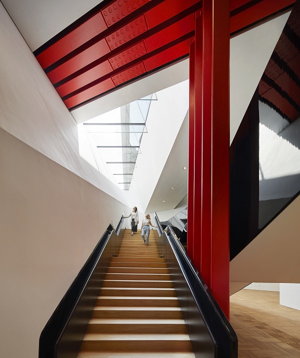
There are two vertiginous stairway entrances (and a lift) to the new gallery space (pictured above right). The Blavatnik Hall also has of course a shop, lots of facilities (bubble gum pink for both Ladies and Gentlemen) including a buggy park, as well as terrific views of the V&A’s big inner courtyard garden. There are easy entrances to the rest of the museum, taking us on the one hand to the ceramic staircase to upper floors and on the other through the galleries of Buddhist art and on to the sculpture gallery.
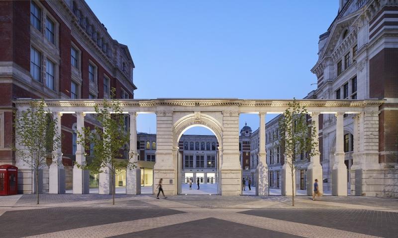
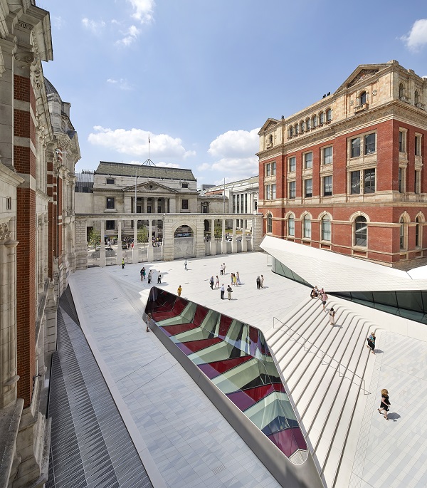
 The whole also supplies a new entrance on Exhibition Road behind the arcaded 1909 Aston Webb stone colonnade of stone gates, each of the 11 now with its specially designed metal fencing with a pattern of royal arms, and echoes of the marks made by World War Two shelling (main picture). We enter the new external Sackler courtyard with a flooring of 11,000 bespoke porcelain tiles, made in Holland (pictured left). There is also a charming café: a new public meet and mingle space with elegantly minimalist tables and chairs designed by architects (perhaps the V&A should add them to their shop inventory). What is provided is a marvellous light hearted entry to the V&A, which as an entity can seem overwhelming, too grand and complex when first encountered.
The museum is finally visibly integrated into Exhibition Road and its companion museums, not to mention Imperial College. Moreover opened up to scrutiny is the red brick beautifully detailed west façade, and the wall of the Henry Cole Wing with its intricate architectural decoration.The western façade also had to be restored, conserved, even strengthened; the new Sackler entrance courtyard is also the ceiling of the new Sainsbury Gallery. A rather bewildering series of engineering conundrums therefore had to be solved, inevitable when integrating a 21st century build into a 19th century Listed Grade One piece of patchwork architecture.
This new way in to even more and better exhibitions, ease of access for visitors, and helping to make even more sense of the whole building too what the Great Court did in 2000 for the British Museum) is a highly intelligent and much needed expansion for the V&A. But I really do worry about the wet footprints – not to mention chewing gum – on all those lovely white porcelain tiles.
rating
Explore topics
Share this article
Add comment
The future of Arts Journalism
You can stop theartsdesk.com closing!
We urgently need financing to survive. Our fundraising drive has thus far raised £49,000 but we need to reach £100,000 or we will be forced to close. Please contribute here: https://gofund.me/c3f6033d
And if you can forward this information to anyone who might assist, we’d be grateful.

Subscribe to theartsdesk.com
Thank you for continuing to read our work on theartsdesk.com. For unlimited access to every article in its entirety, including our archive of more than 15,000 pieces, we're asking for £5 per month or £40 per year. We feel it's a very good deal, and hope you do too.
To take a subscription now simply click here.
And if you're looking for that extra gift for a friend or family member, why not treat them to a theartsdesk.com gift subscription?
more Visual arts
 'We are bowled over!' Thank you for your messages of love and support
Much-appreciated words of commendation from readers and the cultural community
 Folkestone Triennial 2025 - landscape, seascape, art lovers' escape
Locally rooted festival brings home many but not all global concerns
 Sir Brian Clarke (1953-2025) - a personal tribute
Remembering an artist with a gift for the transcendent
 Emily Kam Kngwarray, Tate Modern review - glimpses of another world
Pictures that are an affirmation of belonging
 Kiefer / Van Gogh, Royal Academy review - a pairing of opposites
Small scale intensity meets large scale melodrama
 Jenny Saville: The Anatomy of Painting, National Portrait Gallery review - a protégé losing her way
A brilliant painter in search of a worthwhile subject
 Abstract Erotic, Courtauld Gallery review - sculpture that is sensuous, funny and subversive
Testing the boundaries of good taste, and winning
 Edward Burra, Tate Britain review - watercolour made mainstream
Social satire with a nasty bite
 Ithell Colquhoun, Tate Britain review - revelations of a weird and wonderful world
Emanations from the unconscious
 Rachel Jones: Gated Canyons, Dulwich Picture Gallery review - teeth with a real bite
Mouths have never looked so good
 Yoshitomo Nara, Hayward Gallery review - sickeningly cute kids
How to make millions out of kitsch
 Hamad Butt: Apprehensions, Whitechapel Gallery review - cool, calm and potentially lethal
The YBA who didn’t have time to become a household name

Comments
I look forward to seeing the