Magical Surfaces: The Uncanny in Contemporary Photography, Parasol Unit | reviews, news & interviews
Magical Surfaces: The Uncanny in Contemporary Photography, Parasol Unit
Magical Surfaces: The Uncanny in Contemporary Photography, Parasol Unit
Making it and faking it: two generations transcend the everyday

Magical Surfaces: The Uncanny in Contemporary Photography focuses on two contrasting generations. Beginning in the 1970s, Stephen Shore and Joel Sternfeld travelled America photographing things that are so ordinary, yet so odd, that they transcend the familiar to become surreal. And alongside them are five Europeans, 20 or so years younger who, by and large, seem glued to their computers.
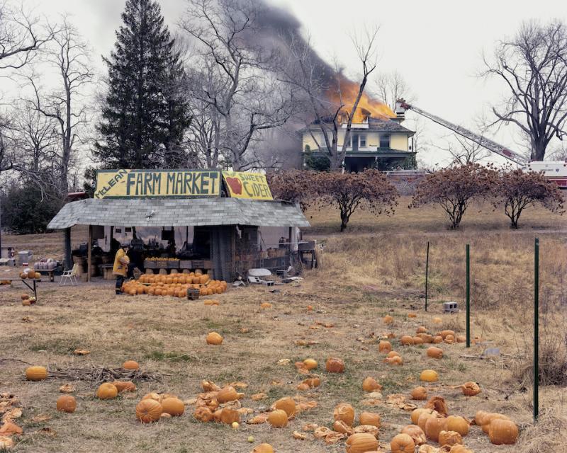
Joel Sternfeld’s McLean, Virginia, December 1978 (main picture) is one of my all-time favourites. In the background is a house on fire; flames are spurting from the roof. Luckily, a crane is in place to rescue the occupants, but the fireman has gone AWOL. Instead of saving lives, he is choosing a pumpkin from the nearby farm stall. Squashed pumpkins litter the foreground; the same bright orange as the fireman’s jacket and the flames they seem to be part of the unfolding tragedy, as though presaging disaster. Since photography stops time, we will never know the outcome; this inexplicable event will endlessly remain an enigma and retain its fascination.
 In another photograph, an elephant is holding up the traffic. Someone is hosing down the hapless creature, which has collapsed in the middle of a country road; but the sheriff is at hand, so this bizarre emergency may yet be resolved.
Knowing that these scenes were witnessed rather than fabricated is crucial to our enjoyment of the photographs. Even finding out that the fire was part of an exercise and the elephant a circus runaway fails to destroy the magic. If we were to discover that the images had been manipulated or digitally created, though, their value would be cancelled. Photography’s link to actuality is of primary importance, I think; sever that connection and you are in danger of losing the plot.
The brilliance of Sternfeld’s pictures comes from the unlikely narratives they record; by contrast, Stephen Shore specialises in stillness and the absence of people and events. With its slanting sunlight and deep shadows, Holden Street, North Adams, Massachusetts ... 1974 looks like a film set waiting for the director to shout “action” and some extras to scurry round the corner.
The white painted church in Bellevue, Alberta (pictured above right: August 21,1974) is so small that it looks like a model. Since there’s no garden or courtyard, the picket fence flanking the doorway serves no purpose other than to aggrandise the entrance and create a sense of place. Painted blue and white, it chimes with the clouds scudding across the sky, yet appears completely out of place. Who put this little box in the middle of nowhere and why? Shore is like an anthropologist looking for clues to explain some alien culture, or a philosopher ruminating on our place in the greater scheme of things.
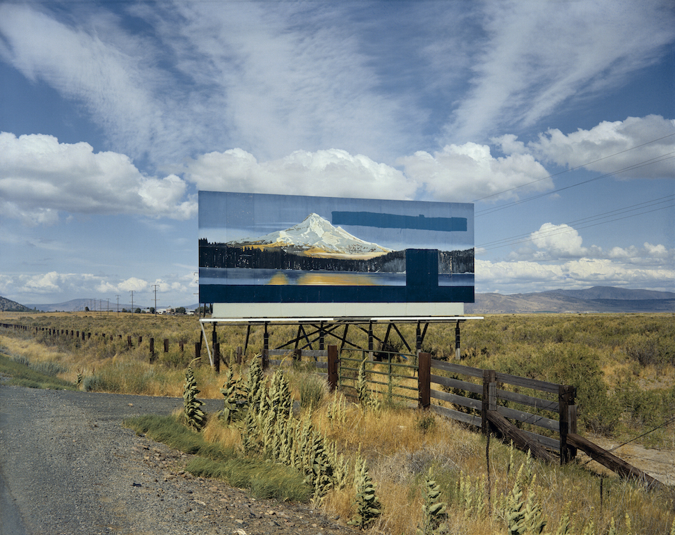
 A billboard has been erected beside Highway 97 (pictured above: US 97, South of Klamath Falls, Oregon, July 21, 1973) showing a snow-clad mountain reflected in the still waters of a blue lake. But the slogans have been painted out so its not clear why this picture of a rural idyll has been erected here, especially as it compares unfavourably with the surrounding landscape; the sky above and the grasses beneath are so much more dramatic and palpable than the billboard scene. Shore seems to be making a point about the paucity of human imagination when compared with the real thing; the joke, of course, is that the landscape being compared with the billboard is itself an image – his photograph.
Elger Esser (Germany) seems to have been looking at paintings. We are gazing across the Venetian lagoon from an inlet on the deserted island of Poveglia that once housed an asylum. The view is framed by two banks, one wooded, the other bearing the remains of an empty building. Suffused in golden light, this elegiac scene is reminiscent of a painting by Turner or Claude. The delicate light may have been digitally enhanced, but who cares when its fragile beauty seems to encapsulate something of the island’s melancholy history.
 If you’ve ever climbed a mountain and marvelled at the blueness of the distant hills and noticed how the dwindling light has the infinite subtlety of water colour washes, you will not be impressed by Jörg Sasse’s (Germany) attempts to duplicate the effect in an ink jet print. Distance has been collapsed; the nearby range is as uniformly black as a cardboard cut-out and the layered space beyond is more like a sequence of theatre flats than a mountain range receding into the distance.
Julie Monaco (Austria) also fakes it; cs_02/4, 2005, is an apocalyptic view of lowering clouds swirling above a boiling sea. The image is not very large yet it has the breadth and drama of a painting by John Martin, the English romantic who enjoyed terrifying viewers with fire and brimstone depictions of the ungodly being dispatched by divine wrath. Yet a deep sense of “so what?” infuses my response. There’s no inherent meaning in the technical trickery.
David Claerbout (Belgium) photographs traffic jams from various angles, then inserts shots of people taken in the studio. Police, fire fighters, drivers and passengers watch and wait, while you wonder why. Whereas Sternfeld’s narratives encourage contemplation of the human condition, these theatrical scenes provoke little speculation beyond the most obvious.
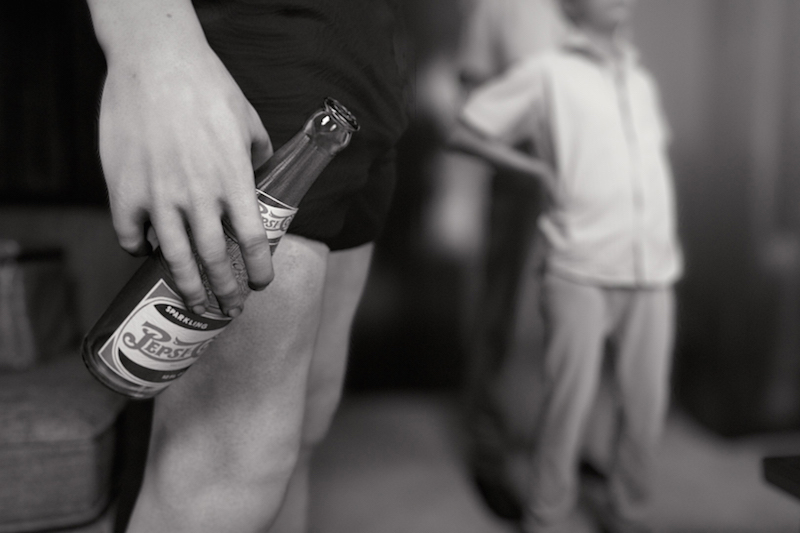
In 1956 Alfred Wertheimer took a photo of Elvis as a gauche young man in boxer shorts. With this photo as a starting point, Claerbout takes us on a 3D tour of Elvis’s body using skin fragments sampled from hundreds of photographs and knitted into a continuum. If the initial photograph is already creepy, this video enlargement is as unreal as a journey round a waxwork (pictured above left: still from KING, after Alfred Wertheimer's 1956 picture of a young man named Elvis Presley, 2016). My advice to the younger generation is to get out more.
- Magical Surfaces: The Uncanny in Contemporary Photography at Parasol Unit until 19 June
rating
Explore topics
Share this article
Add comment
The future of Arts Journalism
You can stop theartsdesk.com closing!
We urgently need financing to survive. Our fundraising drive has thus far raised £49,000 but we need to reach £100,000 or we will be forced to close. Please contribute here: https://gofund.me/c3f6033d
And if you can forward this information to anyone who might assist, we’d be grateful.

Subscribe to theartsdesk.com
Thank you for continuing to read our work on theartsdesk.com. For unlimited access to every article in its entirety, including our archive of more than 15,000 pieces, we're asking for £5 per month or £40 per year. We feel it's a very good deal, and hope you do too.
To take a subscription now simply click here.
And if you're looking for that extra gift for a friend or family member, why not treat them to a theartsdesk.com gift subscription?
more Visual arts
 'We are bowled over!' Thank you for your messages of love and support
Much-appreciated words of commendation from readers and the cultural community
 Folkestone Triennial 2025 - landscape, seascape, art lovers' escape
Locally rooted festival brings home many but not all global concerns
 Sir Brian Clarke (1953-2025) - a personal tribute
Remembering an artist with a gift for the transcendent
 Emily Kam Kngwarray, Tate Modern review - glimpses of another world
Pictures that are an affirmation of belonging
 Kiefer / Van Gogh, Royal Academy review - a pairing of opposites
Small scale intensity meets large scale melodrama
 Jenny Saville: The Anatomy of Painting, National Portrait Gallery review - a protégé losing her way
A brilliant painter in search of a worthwhile subject
 Abstract Erotic, Courtauld Gallery review - sculpture that is sensuous, funny and subversive
Testing the boundaries of good taste, and winning
 Edward Burra, Tate Britain review - watercolour made mainstream
Social satire with a nasty bite
 Ithell Colquhoun, Tate Britain review - revelations of a weird and wonderful world
Emanations from the unconscious
 Rachel Jones: Gated Canyons, Dulwich Picture Gallery review - teeth with a real bite
Mouths have never looked so good
 Yoshitomo Nara, Hayward Gallery review - sickeningly cute kids
How to make millions out of kitsch
 Hamad Butt: Apprehensions, Whitechapel Gallery review - cool, calm and potentially lethal
The YBA who didn’t have time to become a household name

Comments
"Distance has been collapsed;
The tirseome overuse of the
The tirseome overuse of the current (actually not so current) buzz-word "uncanny", is yet another example of the herd-like instincts of curators and academics. Rather like the tiresome overuse of another current (actually not so current) buzzword "abjection". These people can only get excited by things they think will gain the approval of others of their ilk, who in turn....