The Everyday and the Extraordinary, Towner Art Gallery, Eastbourne review - the ordinary made strange | reviews, news & interviews
The Everyday and the Extraordinary, Towner Art Gallery, Eastbourne review - the ordinary made strange
The Everyday and the Extraordinary, Towner Art Gallery, Eastbourne review - the ordinary made strange
Old favourites revisited with pleasure at show of familiar objects transformed

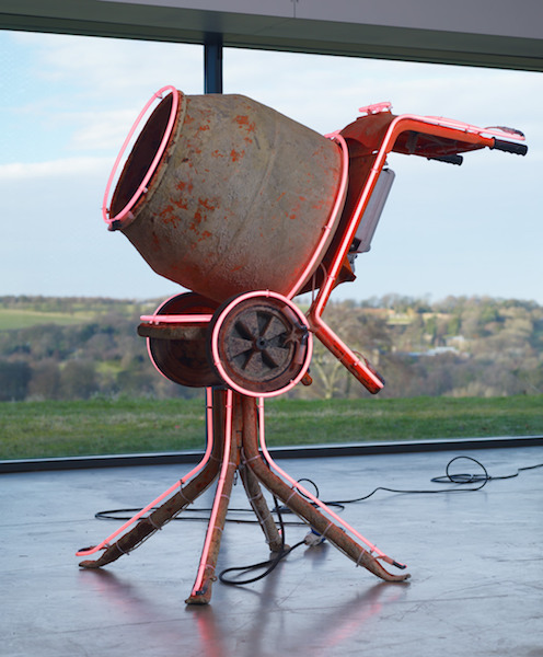
There’s a building site outside the Towner Art Gallery and a cement mixer seems to have strayed over the threshold into the foyer. This specimen (pictured below right) no longer produces cement, though. David Batchelor has transformed it into an absurdist neon sign by outlining it with fluorescent tubes.
The Everyday and the Extraordinary explores the transformation of banal objects into art. A painting by Philip Core introduces the theme. We see Marcel Duchamp, the inventor of the readymade, playing chess with Andy Warhol, the doyen of pop art; they sit surrounded by the artworks they created by appropriating familiar items and making them strange. But as this interesting exhibition reveals, there are as many ways of transforming commonplace objects into art as there are artists.
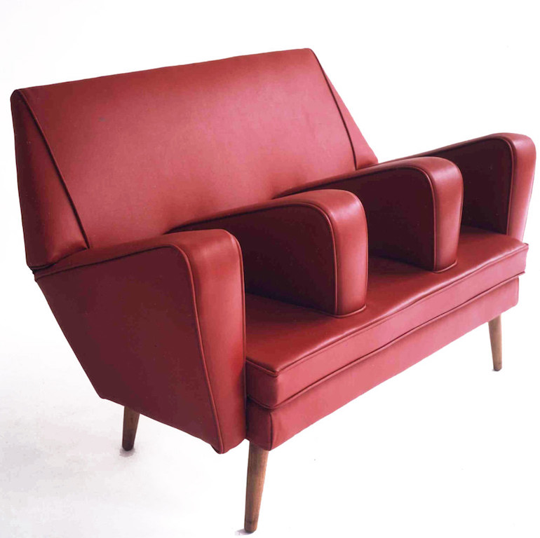
 The simplest ideas are often the most powerful. Elizabeth Wright has copied every detail of a scruffy moped used for pizza deliveries, but has enlarged them by 145 per cent to create a monster. Nina Saunders has added two extra arms to a red sofa designed for ladies (pictured below left). Divided into three, the already narrow seat becomes even more constricting. A metaphor for the constraints hampering most women, the work’s neatness and perfection makes it all the more troubling. This is the polite face of bondage.
Jean-Luc Vilmouth has cut eye-shaped holes in a dustpan, a trowel, a coffee pot, ladle and pedal bin. His transparent acts of vandalism turn handles into noses and inanimate objects into mask-like faces. The dual identities thus created have an Inherent absurdity which is extremely pleasing.
By filling a man-sized wellington boot with concrete, Richard Wentworth evokes fears of being drowned by water-filled waders or sucked to a certain death by quicksands. Look inside though, and you realise that a child’s wellington is trapped within; this and the title Guide triggers more subtle thoughts about the relationship between father and son, or a man and the child hidden inside him.
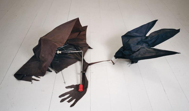
A broken umbrella lies abandoned while beside it stands a predatory crow fashioned from another umbrella (main picture). By naming the ensemble Crow and Carrion, Bill Woodrow invites one to see the crumpled umbrella as a carcass, but by cutting the shape of a human hand out of the material, he raises macabre questions about the identity of the corpse.
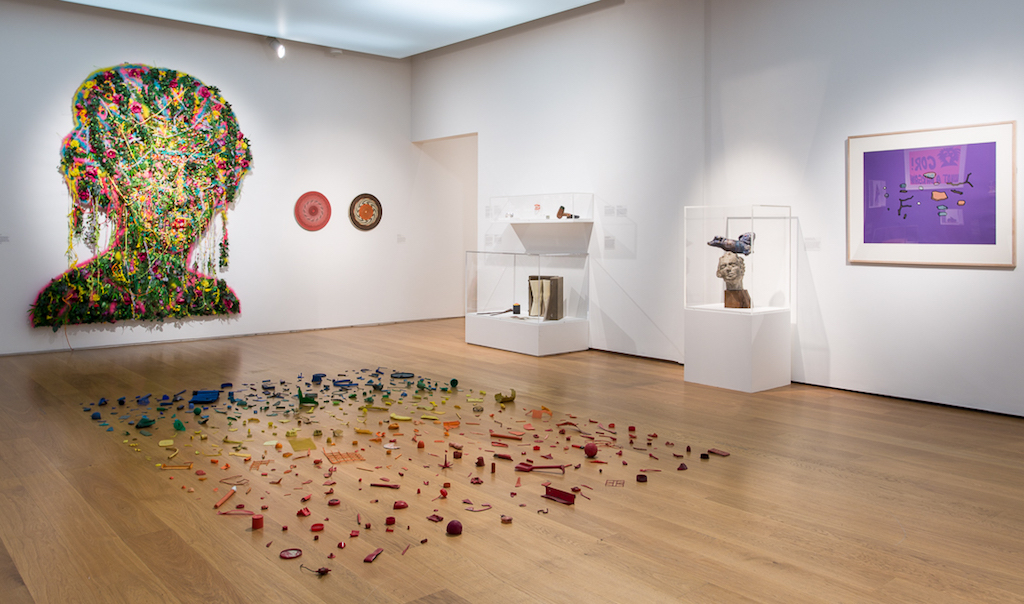
"Treading a fine line between kitsch and something serious,” is how Huw Locke describes his work. “Piles of tacky cake decorations, gaudy trimmings, cheap toys and plastic flowers” are amassed into a tangle of intoxicating clutter through which one can just make out the features of the Queen (pictured below, in installation shot by Rob Harris). Her Majesty peers through a forest of plastic feathers, ferns, fruit and fronds rather like MIss Haversham peeping out from behind a wedding veil festooned in cobwebs. The monarch, Locke seems to suggest, is little more than a kitsch construct made of trinkets and tat – the opium of the people, as Karl Marx might have said.
 Some of the work, which mainly comes from the Arts Council Collection, dates back to the 1960s and many pieces are from the 1970s or ‘80s. Most are as fresh as the day they were made, but Anya Gallacio’s installation Preserve (Chateau) is deliberately allowed to rot. A sombre meditation on the passing of time, it consists of 100 red gerberas sandwiched between the wall and a pane of glass. As the exhibition continues they will turn brown, begin to smell and cloud the glass with the juices of their decay. Gallacio first used red gerberas in 1991 when she lined the window of Karsten Schubert’s gallery in Charlotte Street with the flamboyant flowers. Preserve Beauty was the paradoxical title of a work in which no attempt was made to conserve the wilting flowers. The same appeal has been made and ignored in each subsequent iteration of the idea; over the years, witnessing the death of the flowers has become a collective act of ritualised cruelty.
Tony Cragg’s installation New Stones - Newton’s Tones (in image below) has similarly accrued layers of meaning since it was first realised in 1978. Hundreds of discarded bits of plastic are arranged on the floor in a rectangle graded from red through orange, yellow and green to blue and purple. Forty years ago, making an artwork from bits of cheap rubbish was a refreshing novelty. Now, though, the idea seems to contain an amazingly prescient warning. We have managed to pollute our echo system to such a degree that plastic particles are accumulating not just in the soil on the surface of the globe, but in deep sea sediments that will form the geological strata of the future. As Cragg’s colourful carpet seems to predict, many of the New Stones currently being laid down will contain non-biodegradable plastics of all varieties.  Mona Hatoum’s sculpture + And - does not rightly belong in this company, since it doesn’t incorporate found objects, but it is one of my favourite artworks and exemplifies the power of simplicity to such a degree that I feel bound to mention it. A wooden box is filled with sand. As it silently rotates, a serrated metal arm draws concentric rings in the sand while a second arm smooths the sand and erases the rings. This endless cycle of repetition is as comforting as day following night and as mesmerising as waves breaking on the shore or water trickling over rocks. I could watch it for ever.
rating
Explore topics
Share this article
The future of Arts Journalism
You can stop theartsdesk.com closing!
We urgently need financing to survive. Our fundraising drive has thus far raised £49,000 but we need to reach £100,000 or we will be forced to close. Please contribute here: https://gofund.me/c3f6033d
And if you can forward this information to anyone who might assist, we’d be grateful.

Subscribe to theartsdesk.com
Thank you for continuing to read our work on theartsdesk.com. For unlimited access to every article in its entirety, including our archive of more than 15,000 pieces, we're asking for £5 per month or £40 per year. We feel it's a very good deal, and hope you do too.
To take a subscription now simply click here.
And if you're looking for that extra gift for a friend or family member, why not treat them to a theartsdesk.com gift subscription?
more Visual arts
 'We are bowled over!' Thank you for your messages of love and support
Much-appreciated words of commendation from readers and the cultural community
 Folkestone Triennial 2025 - landscape, seascape, art lovers' escape
Locally rooted festival brings home many but not all global concerns
 Sir Brian Clarke (1953-2025) - a personal tribute
Remembering an artist with a gift for the transcendent
 Emily Kam Kngwarray, Tate Modern review - glimpses of another world
Pictures that are an affirmation of belonging
 Kiefer / Van Gogh, Royal Academy review - a pairing of opposites
Small scale intensity meets large scale melodrama
 Jenny Saville: The Anatomy of Painting, National Portrait Gallery review - a protégé losing her way
A brilliant painter in search of a worthwhile subject
 Abstract Erotic, Courtauld Gallery review - sculpture that is sensuous, funny and subversive
Testing the boundaries of good taste, and winning
 Edward Burra, Tate Britain review - watercolour made mainstream
Social satire with a nasty bite
 Ithell Colquhoun, Tate Britain review - revelations of a weird and wonderful world
Emanations from the unconscious
 Rachel Jones: Gated Canyons, Dulwich Picture Gallery review - teeth with a real bite
Mouths have never looked so good
 Yoshitomo Nara, Hayward Gallery review - sickeningly cute kids
How to make millions out of kitsch
 Hamad Butt: Apprehensions, Whitechapel Gallery review - cool, calm and potentially lethal
The YBA who didn’t have time to become a household name
