Building the Picture, National Gallery | reviews, news & interviews
Building the Picture, National Gallery
Building the Picture, National Gallery
It wasn't all about Madonnas. Italian Renaissance artists also knew how to paint architecture

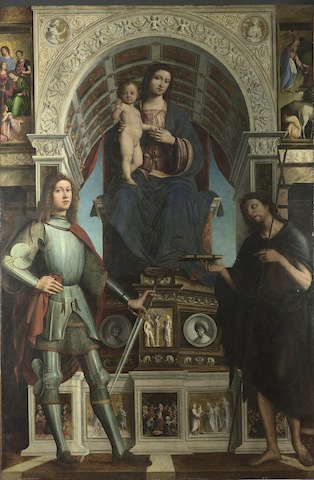
Viewed through an arch designed to evoke a dimly lit chapel, Lorenzo Costa and Gianfrancesco Maineri’s The Virgin and Child with Saints, 1498-1500, is strikingly legible (pictured below right). The Virgin sits on a marble throne beneath a richly decorated arch, the throne’s fictive architecture covered with panels depicting Biblical scenes, the infant Christ standing precariously on his mother’s knee.
And Costa and Maineri push the point still further; the narrative panels set into the Virgin’s throne representing painted, mosaic and sculpted stone surfaces are a tour de force demonstration that in the right hands, a single panel could fulfil the role of the complex, multi-panelled altarpieces that had prevailed for so long.
 There is no need for any lengthy text on the wall here; Costa and Maineri’s magnificent altarpiece demands that we forget about architecture as a backdrop to a narrative, and think of it instead as a protagonist in its own right. In just 35 pictures, this exhibition is a trenchant essay on the ways in which Italian Renaissance painters used architecture to define and articulate space, tie a painting to its setting, emphasise and punctuate narrative and determine with ever greater precision the emotional effect of a painting on its viewers.
In Sassetta’s Saint Francis renounces His Earthly Father, about 1440, an elaborate building is used to heighten the emotional drama of the story, while emphasising the division between sacred and profane spaces. A naked Saint Francis stands by the Bishop of Assisi inside a loggia, while his clothes, removed symbolically to indicate the renunciation of his previous life, lie at the feet of his father who stands helplessly outside, shut out by his son in a scene that reverberates with the pain of separation.
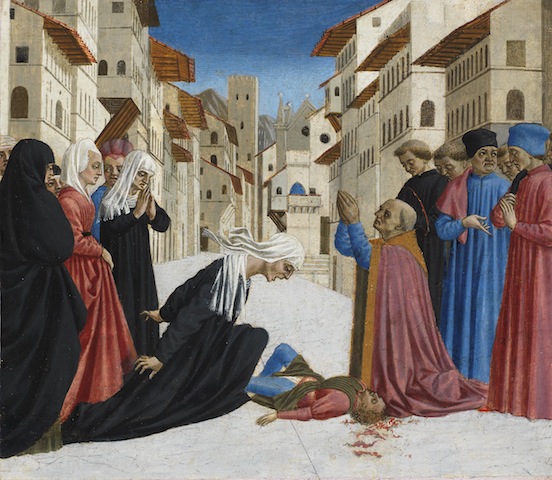
While Sassetta’s architecture was for the most part imagined, an added impetus could sometimes be achieved by drawing on familiar surroundings. In Florence, Sandro Botticelli and Domenico Veneziano both increased the narrative power of paintings involving the local Saint Zenobius by setting the action in recognisably Florentine streets. Veneziano’s Saint Zenobius Bishop of Florence restores to life a widow's son killed in Borgo degli Albizzi, Florence, about 1442-8 (pictured below), shows the saint reviving a dead child, and uses architecture to locate the narrative in the streets around the church of San Pier Maggiore, a decision calculated to build dramatic tension. The buildings themselves affect the mood of the painting, and they crowd in on the figures to generate an atmosphere of anxiety and claustrophobia.
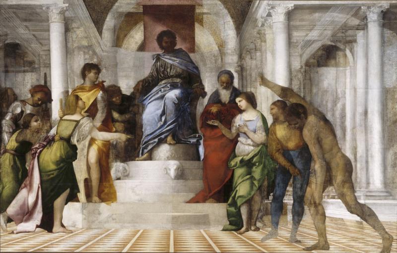
 Sebastiano del Piombo’s The Judgement of Solomon, about 1506-11 (main picture), is an extraordinary example of a painter using architecture to suggest and control space, a strategy that helps to define the emotional pitch of the work. It is a vast and intriguing painting and had it ever been finished, its marble columns and arches would have enhanced its palatial setting, with real space merging with and extending into pictorial space. But seen head on, there is something odd about it. The figures are a little flat, the perspective seems strangely compressed, Solomon’s admittedly unfinished face is obscured by shadow.
The clue is in the painting’s asymmetry, which hints that we should look at it from the right. And in fact, seen from this viewpoint, the painting resolves fully into three dimensions, the floor tiles opening out into diamonds, and Solomon’s face appearing more legible. By placing us to the right, del Piombo absorbs us into the drama of the painting, giving us a privileged role in the events taking place before us. We are not placed directly in front of Solomon as lowly subjects brought before the king, instead our view is slightly more familiar, as if we are part of his court. In the story this painting depicts, Solomon has to decide which of two women is a baby’s true mother. The viewer, stood to the right of the painting, stands on the side of the rightful mother – not only are we given a privileged viewpoint, we are also cast as wise, righteous and just.
It must surely be to the curators’ credit that they have resisted telling visitors where to put themselves to view this painting and instead, a clever bit of hanging means we stumble across the best viewing position ourselves. Letting the pictures speak for themselves is a great strength of this exhibition, a fruit of the National Gallery’s current focus on its own collections, which encourages both scholars and the public to look at familiar paintings afresh. There is a welcome sense of the National Gallery trying to engage with the public, an important factor, one imagines, behind the publication of a free, online catalogue instead of a book.
- Building the Picture: Architecture in Italian Renaissance Painting at the National Gallery until 21 September
- Read the exhibition catalogue online
Explore topics
Share this article
The future of Arts Journalism
You can stop theartsdesk.com closing!
We urgently need financing to survive. Our fundraising drive has thus far raised £49,000 but we need to reach £100,000 or we will be forced to close. Please contribute here: https://gofund.me/c3f6033d
And if you can forward this information to anyone who might assist, we’d be grateful.

Subscribe to theartsdesk.com
Thank you for continuing to read our work on theartsdesk.com. For unlimited access to every article in its entirety, including our archive of more than 15,000 pieces, we're asking for £5 per month or £40 per year. We feel it's a very good deal, and hope you do too.
To take a subscription now simply click here.
And if you're looking for that extra gift for a friend or family member, why not treat them to a theartsdesk.com gift subscription?
more Visual arts
 'We are bowled over!' Thank you for your messages of love and support
Much-appreciated words of commendation from readers and the cultural community
 Folkestone Triennial 2025 - landscape, seascape, art lovers' escape
Locally rooted festival brings home many but not all global concerns
 Sir Brian Clarke (1953-2025) - a personal tribute
Remembering an artist with a gift for the transcendent
 Emily Kam Kngwarray, Tate Modern review - glimpses of another world
Pictures that are an affirmation of belonging
 Kiefer / Van Gogh, Royal Academy review - a pairing of opposites
Small scale intensity meets large scale melodrama
 Jenny Saville: The Anatomy of Painting, National Portrait Gallery review - a protégé losing her way
A brilliant painter in search of a worthwhile subject
 Abstract Erotic, Courtauld Gallery review - sculpture that is sensuous, funny and subversive
Testing the boundaries of good taste, and winning
 Edward Burra, Tate Britain review - watercolour made mainstream
Social satire with a nasty bite
 Ithell Colquhoun, Tate Britain review - revelations of a weird and wonderful world
Emanations from the unconscious
 Rachel Jones: Gated Canyons, Dulwich Picture Gallery review - teeth with a real bite
Mouths have never looked so good
 Yoshitomo Nara, Hayward Gallery review - sickeningly cute kids
How to make millions out of kitsch
 Hamad Butt: Apprehensions, Whitechapel Gallery review - cool, calm and potentially lethal
The YBA who didn’t have time to become a household name

Add comment