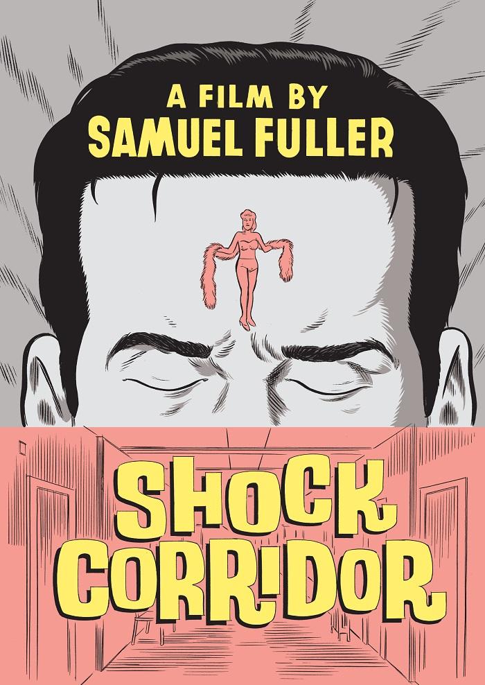
Starting out as a publisher of laser discs in 1984, Manhattan's Criterion Collection has become America’s most famous independent publisher of DVDs and Blu-ray discs. A key factor in its success is the graphic range of the discs’ exquisitely designed covers.
Each is conceived and rendered to capture the essence of a film or to propose a critical re-evaluation through the tweaking or embellishing of a well-known image, as in the cases of Belle du Jour, The Night Porter and A Man Escaped. Classic images from A Canterbury Tale and Eraserhead were painted to cast the films in a subtle new light. The Brando vehicle The Fugitive Kind was given the pulp-fiction spin, Fantastic Mr Fox the Last Supper treatment.
Sometimes the consumer is asked to forget images so familiar they’ve become clichés, and to consider the importance of a neglected detail from the film. Paris, Texas isn't represented by Harry Dean Stanton staring at the Mojave Desert or the pink angora-clad Nastassja Kinski looking over her shoulder, but by a haunting Wim Wenders photo of the titular lot sign standing on a scrubby tract of land.
 Quadrophenia’s Mod aesthetic is simply evoked by combining a photo of Phil Daniels on his scooter with a version of the Who’s target graphic comprised of Pete Townshend’s lyrics. Stagecoach’s most dangerous stunt is distilled in a pastel-colored faux silk screen.
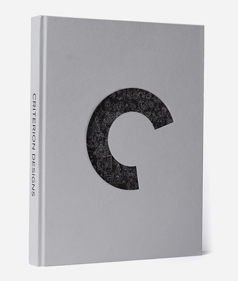
Criterion’s covers have inspired earnest homages from aficionados and, from the makers of the teen comedy-drama Me and Earl and the Dying Girl, mocking parodies that prove even ribald imitation is the sincerest form of flattery. The majority of them – and some of the artists’ preparatory sketches – can be seen in the sumptuous coffee-table book Criterion Designs (pictured above right), which was written and designed by company art director and designer Eric Skillman.
GRAHAM FULLER: How does the design process begin?
ERIC SKILLMAN: There’s a creative process on our end and on the designer’s end. On our end, we start by watching the film, and afterwards the producer, Criterion president Peter Becker, and a few others will meet with art director Sarah Habibi and/or myself to talk through the characters, the important moments, and what the story of the release is going to be. It could be a newly rediscovered film that hasn’t been seen for 30 years, an underappreciated film we want to build a little monument to, a film we want to knock the cobwebs off because it’s become like homework for people and we want to get them to watch it and not just read about it, or it could be something else. We’ll decide from there the tone and the themes we want to hone in on, without knowing exactly what we want to see. Then we’ll find a designer or illustrator who can capture that tone, experiment with those ideas, and try to make something beautiful.
What proportion of the images are created digitally, compared with those created as actual artworks?
Everything is ultimately composited digitally, though I can’t think of anything that’s entirely done that way. We owe a lot, obviously, to existing photographs of actors or screen grabs. In creating a new image, there’s almost always something that’s handmade.
What about the fantastically intricate images of human wiring that were created for the Scanners cover, as magnified to full-page size in the coffee-table book? They look computer-generated.
They were entirely hand-drawn by Connor Willumsen, an insanely talented artist and one of the most versatile we work with. He’s always working in new styles.
You use a variety of different media in your own designs. For example, the one for Berlin Alexanderplatz is based on a woodcut.
That was the reference, though it was actually made with Sharpie markers. It had to be because I’m not proficient with woodcuts.
They’re such radically different experiences that they deserve their own unique identities
Your I Married a Witch design looks like it came from an original poster.
It didn't, though. It’s derived from the cultural icon that is Veronica Lake. That silhouette image of her appeared everywhere, but The Sullivan’s Travels poster was a particular influence.
You show her peekaboo hairstyle turning into smoke from the fire on which she was burned in Salem.
The conception of witches in the film is that they are made of smoke. They live inside wood, trees, and when they're not actively taking human form they float around as puffs of smoke.
Why did Criterion break with the uniform design template - an iconic film still set against a plain background - used for its early DVD covers?
The decision to break with the template predates my joining the company 14 years ago, but I believe it was considered a little stale and didn’t do justice to the kinds of films that were on offer. When I first got there, there was already an impulse to bring in outside designers to make something beautiful that the template couldn’t quite sustain. One of Criterion’s great strengths is the diversity of films it releases, so to treat them all the same would ultimately do them a disservice. Apart from the greatness, is there anything that connects The Seventh Seal to Nashville or a Chaplin film? They’re such radically different experiences that they deserve their own unique identities. The mission has stayed the same, though I like to think we keep improving.
Would you hope the cover images stand as artworks in their own right?
I hope they’re beautiful objects in their own right, but I think their value is in how well they serve the film they’re representing. A beautiful object that misrepresented the film would be a failure as a cover. Its value as a cover has as much to do with its honesty as its beauty.
Is there a new Criterion design you’re especially excited about?
I’m very excited about Don’t Look Back, D.A. Pennebaker’s Bob Dylan film [which uses bold graphics and shows Dylan in dark glasses smoking a cigarette in the back of a car during his 1965 concert tour]. There were a lot of rounds on that one because it’s a big title for us, but I was really happy the way it turned out – also because I’m a Dylan fan!
Read other articles in We Made It, our series on craft in partnership with Bruichladdich
Browse a gallery of Criterion Collection covers below (click on the thumbnails to enlarge)


Add comment