Richard Rogers: Inside Out, Royal Academy, Burlington Gardens | reviews, news & interviews
Richard Rogers: Inside Out, Royal Academy, Burlington Gardens
Richard Rogers: Inside Out, Royal Academy, Burlington Gardens
Lively and spacious retrospective of the colour-addicted starchitect
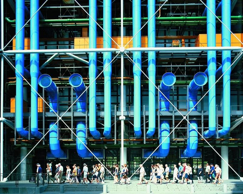
Richard Rogers is addicted to colour. His wardrobe dazzles, and this biographical anthology opens with a selection of Rogers’ aphorisms and statements in bold black on a wall painted a coruscating knock-out fuschia. And then there are the buildings. Rogers, 80 this month, is now a world-famous multi-honoured “starchitect”. He has successfully practised for over 50 years.
Throughout the show there is an emphasis on the life as well as the work, the beliefs as well as the buildings. Rogers both tells and shows us that architecture is so obviously a social and political art, aspects ignored at our peril, and simply not the creation of individually impressive buildings in isolation. There are two big galleries full of memorabilia, photographs of friends, family and personnel, slide shows of significant buildings, drawings and architectural models of unusual clarity.
 The third gallery has a mobile library cart, a coffee cart energised by the customer cycling, unbuilt master city plans for Florence, Shanghai and London (see gallery overleaf) and a big wall acting as a bulletin board for any visitor to contribute ideas for London. Rogers himself wants a million more trees planted in the next few years in the city he now loves above all others. His hopes are both inspirational and at times curiously naïve. An idealist, he seems not to have a cynical gene, famously clashes with the reactionary and destructive views of Prince Charles – and does not win – yet also manages to design and see built a handful of the best-known buildings of the age, some for leading commercial concerns.
Success was hardly assured during his student days. “His designs will continue to suffer while his drawing is so bad, his method of work so chaotic and his critical judgment so inarticulate”: thus his second year report in 1958 from the Architectural Association, which is on display. He is notably dyslexic.
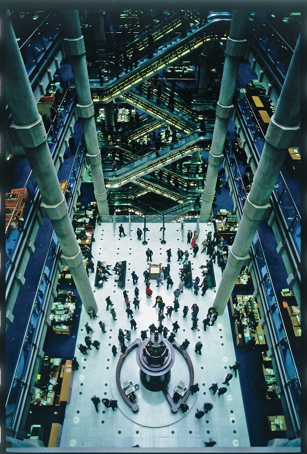
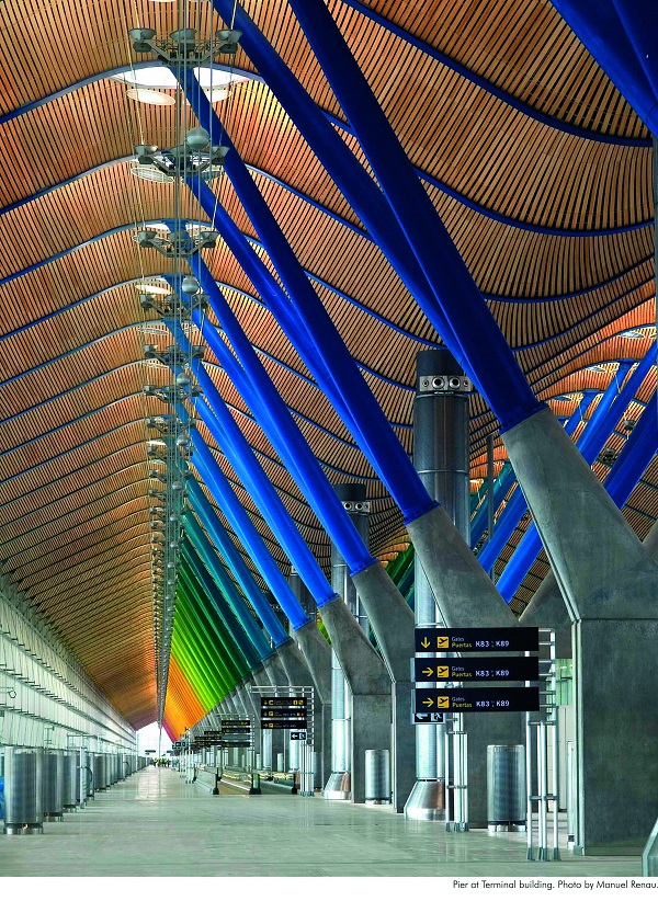
Rogers is no sentimentalist about the countryside, and reminds us that 80 percent of the world is now urban. He plays down the importance of individual buildings in favour of a holistic approach, yet the evidence of his landmark buildings shows he is hardly averse to the big statement. Several featured here, radical and photogenic, have pioneered regeneration. The Pompidou Centre in Paris, 1977 (Rogers + Piano), was controversial - parts of an old neighbourhood were destroyed for the site. But with its colour-coded services on the outside of the building like a vast meccano set, it was a staggering surprise which made Paris a draw for postwar contemporary art. Although its running costs and functionality have been questioned, Lloyds in London (1986) 25 years on became the youngest building ever to be listed Grade 1 (pictured above right © Janet Gill). While the impressive new terminal at Madrid Barajas airport (2006) (pictured below left © Manuel Renau), has had severe luggage delivery problems, Terminal 5 at Heathrow (2008) does seem to work well. Rising up to add to the mix is the Leadenhall Building, also known as the cheese-grater, 48 floors high in the heart of the City, and contributing at its ground level a new public square.
 Clients of course matter, and they have been both sympathetic and antipathetic: the glass box house Rogers and his then wife Su designed for his own parents in Wimbledon in 1967 has just been listed; the use the government made of the Millennium Dome (1999) tarnished it in the public eye, but its subsequent incarnation as the O2 has ensured both its popularity and an understanding of its engineering and aesthetic worth.
Featured in the show is a disconcerting testament to the influx of foreign billionaires buying into London property as a relatively safe haven: his monolithic 1 Hyde Park/100 Knightsbridge is a modern glass-walled fortress that is an eminently visible embodiment of capitalist excess. With no inclusion of the colourful and compassionate Maggie’s Centre at Charing Cross Hospital, the choice of buildings is not necessarily coincident with Rogers’ public, sincere and aspirational idealism.
The exhibition, immensely lively and spacious, does not rely on those incomprehensible architectural plans so often characteristic of shows about building design. Documents and memorabilia intertwine with visual essays on the buildings themselves, and the whole is a stimulating mix of the itchily irritating and the highly intelligent, the unexpected and the inspirational. Needs more benches, though, to pause for thought.
See gallery overleaf
Click on the images to enlarge
Explore topics
Share this article
The future of Arts Journalism
You can stop theartsdesk.com closing!
We urgently need financing to survive. Our fundraising drive has thus far raised £49,000 but we need to reach £100,000 or we will be forced to close. Please contribute here: https://gofund.me/c3f6033d
And if you can forward this information to anyone who might assist, we’d be grateful.

Subscribe to theartsdesk.com
Thank you for continuing to read our work on theartsdesk.com. For unlimited access to every article in its entirety, including our archive of more than 15,000 pieces, we're asking for £5 per month or £40 per year. We feel it's a very good deal, and hope you do too.
To take a subscription now simply click here.
And if you're looking for that extra gift for a friend or family member, why not treat them to a theartsdesk.com gift subscription?
more Visual arts
 'We are bowled over!' Thank you for your messages of love and support
Much-appreciated words of commendation from readers and the cultural community
 Emily Kam Kngwarray, Tate Modern review - glimpses of another world
Pictures that are an affirmation of belonging
 Kiefer / Van Gogh, Royal Academy review - a pairing of opposites
Small scale intensity meets large scale melodrama
 Jenny Saville: The Anatomy of Painting, National Portrait Gallery review - a protégé losing her way
A brilliant painter in search of a worthwhile subject
 Abstract Erotic, Courtauld Gallery review - sculpture that is sensuous, funny and subversive
Testing the boundaries of good taste, and winning
 Edward Burra, Tate Britain review - watercolour made mainstream
Social satire with a nasty bite
 Ithell Colquhoun, Tate Britain review - revelations of a weird and wonderful world
Emanations from the unconscious
 Rachel Jones: Gated Canyons, Dulwich Picture Gallery review - teeth with a real bite
Mouths have never looked so good
 Yoshitomo Nara, Hayward Gallery review - sickeningly cute kids
How to make millions out of kitsch
 Hamad Butt: Apprehensions, Whitechapel Gallery review - cool, calm and potentially lethal
The YBA who didn’t have time to become a household name
 Bogancloch review - every frame a work of art
Living off grid might be the meaning of happiness


Add comment