Carl Andre / Rosa Barba, Turner Contemporary | reviews, news & interviews
Carl Andre / Rosa Barba, Turner Contemporary
Carl Andre / Rosa Barba, Turner Contemporary
Two seductive exhibitions show that minimalism can be sensuous and analogue timeless

What a different country the past is. When one thinks of all the famous art works that caused an outrage when they were first unveiled and yet we now admire as ground-breaking and consider “seminal”. It’s probably everything that ever caused a critic of the old guard to sneer and that much maligned member of the unsuspecting public to have a fainting fit.
These thoughts naturally bring one to the American minimalist Carl Andre. You can’t mention Andre without the bricks. When Tate first displayed them as part of its collection in 1976 it’s really no exaggeration to say that the ensuing scandal was even bigger than the one for his trial, almost a decade later, for the murder of his wife, the artist Ana Mendieta, of which Andre was acquitted.
It’s a dense display and feels anything but arid and lifeless
Go to Level 4, Room 8 of Tate Modern and you’ll find Andre’s bricks. What can one say about Equivalent VIII, 1966, other than to note its material dimensions and the fact that, to employ a cliché, “it is what it is”? Yet for many it’s still a troubling work: was this art’s endgame (though it wouldn’t have been the first nor the last)? A work about which its creator adamantly eschews meaning might, after all, be seen as a gesture of nihilism, however unintended. Art world types may find the rehearsal of such questions wearisome, but they don’t go away. They especially don’t go away when Andre’s around.
To see the bricks today is to visit a work that, to me, communicates stubbornly little, whether one wishes to approach it in the spirit of generosity or not. Even if one has a fetish about the variegated surfaces of industrial materials, there’s surely little to inspire wonder in the smoothly bland surfaces of these uniformly pale yellow firebricks: 120 are stacked on the floor, in a two deep grid, and cordoned off to keep visitors from getting too close. Surrounded by Lewis Baltz’s small, grainy photographs of industrial spaces, and with only one other sculpture in the long gallery, invisible from this vantage point – one of Andre’s steel and zinc checkerboard arrangements – the room feels like a dead zone. Mute, uncommunicative, dead.

The experience couldn’t be more different at Turner Contemporary. Here are eight of Andre’s sculptures dating from 1967 to 1983, filling just one gallery. It’s a dense display and feels anything but arid and lifeless. As you step across the gallery’s entrance you’ll find a “runner” of metal plates in shades of polished black and grey laid across the floor. The work, 4 x 25 Altstadt Rectangle, 1967, stretches from almost one length of the gallery to the other. You’re invited to walk across its worn surface, and you’ll occasionally hear the satisfying rattle of dislodged metal as you do so.
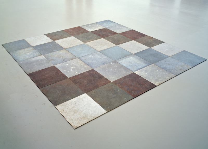
There are two rough-hewn timber works, one of which is Phalanx, 1981 (main picture), consisting of 14 wooden posts arranged to form an arrowhead which points towards the door. The other, Timber Piece (Well), was originally made in 1964 but remade in 1970, and is of a darker hue. It’s a dense, rusticated mass of 28 red cedar posts horizontally stacked and taller than the average person. To the far left, there’s a metal checkerboard in silvery hues, copper browns and mottled blues (pictured above: Weathered, 1970 © Stichting Kröller-Müller Museum), and in one corner two small gleaming zinc grids, their oxidised surfaces creating chance, intricate patterns.
Around the walls we find Andre’s concrete poems, created with a manual typewriter: words and sentences are presented in varying grid formats or tightly overlap, their meanings squeezed out by degrees. There’s nothing about this display that feels austere. It’s beautifully expressive and sensual. Painted on the walls in earthy browns, we also find Andre’s “mission statements”. “As Turner severed colour from depiction,” we read, “so I attempt to sever matter from depiction”. Surveying these works, seeing how this exhibition unfolds like a delightful surprise, this doesn’t feel such a grandiose statement at all.

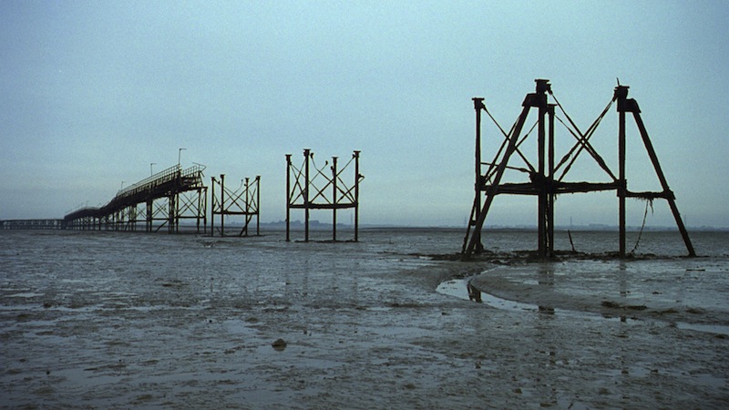
Like fellow Berlin resident Tacita Dean, Rosa Barba’s work pays homage to defunct celluloid, even though there’s only one film in her exhibition. The huge projector which hums in the background provides the gentle soundtrack to a silent film surveying the Kent and Margate coasts (pictured above: Subconscious Society, 2013 © Rosa Barba). Shabby, disused buildings and broken piers come into view, and a long aerial shot of the ribbed and undulating sand reminds us of the primordial nature of this stretch of land, before the invention of tourism.
But one can see that it’s the film projector, gleaming white in the shadows, that visitors are far more fascinated by than the moving image. Bisected to reveal its workings, the projector has become a lugubrious kinetic sculpture, a burnished object of admiration and wonder. In a second room, arranged like steadfast sentinels, stand a line of anatomised projectors. In jerkily hypnotic procession, loops of transparent film weave through delicate metal hinges. Whatever is on there, the projectors aren’t giving away their secrets.
 Nearby, a manual typewriter punches a code on celluloid, and the film grows like knitted yarn, falling to the floor and bunching up in a tangle. Soon you imagine strips of celluloid completely filling the gallery.
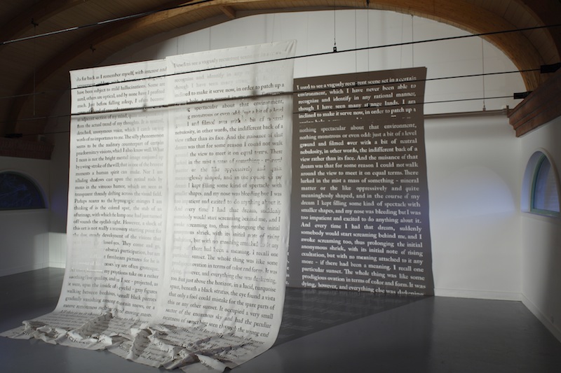
But meaning is dodged and obfuscated. We don’t know if the words spilling from the typewriter relate to the words that have been neatly punched out onto two translucent curtains hanging to the left, which resemble pages torn from an outsized book but whose printed words have become negatives (pictured above right: The Personal Experience Behind Its Description, 2009 © Rosa Barba). Words and letters drift over you, provoking a stream of associations but proving elusive. It’s wonderful to see how much Andre and Barba, with two very strong and resonant exhibitions, so beautifully complement each other.
- Carl Andre: Mass & Matter / Rosa Barba: Subject to Constant Change at Turner Contemporary until 6 May
Explore topics
Share this article
The future of Arts Journalism
You can stop theartsdesk.com closing!
We urgently need financing to survive. Our fundraising drive has thus far raised £49,000 but we need to reach £100,000 or we will be forced to close. Please contribute here: https://gofund.me/c3f6033d
And if you can forward this information to anyone who might assist, we’d be grateful.

Subscribe to theartsdesk.com
Thank you for continuing to read our work on theartsdesk.com. For unlimited access to every article in its entirety, including our archive of more than 15,000 pieces, we're asking for £5 per month or £40 per year. We feel it's a very good deal, and hope you do too.
To take a subscription now simply click here.
And if you're looking for that extra gift for a friend or family member, why not treat them to a theartsdesk.com gift subscription?
more Visual arts
 'We are bowled over!' Thank you for your messages of love and support
Much-appreciated words of commendation from readers and the cultural community
 Folkestone Triennial 2025 - landscape, seascape, art lovers' escape
Locally rooted festival brings home many but not all global concerns
 Sir Brian Clarke (1953-2025) - a personal tribute
Remembering an artist with a gift for the transcendent
 Emily Kam Kngwarray, Tate Modern review - glimpses of another world
Pictures that are an affirmation of belonging
 Kiefer / Van Gogh, Royal Academy review - a pairing of opposites
Small scale intensity meets large scale melodrama
 Jenny Saville: The Anatomy of Painting, National Portrait Gallery review - a protégé losing her way
A brilliant painter in search of a worthwhile subject
 Abstract Erotic, Courtauld Gallery review - sculpture that is sensuous, funny and subversive
Testing the boundaries of good taste, and winning
 Edward Burra, Tate Britain review - watercolour made mainstream
Social satire with a nasty bite
 Ithell Colquhoun, Tate Britain review - revelations of a weird and wonderful world
Emanations from the unconscious
 Rachel Jones: Gated Canyons, Dulwich Picture Gallery review - teeth with a real bite
Mouths have never looked so good
 Yoshitomo Nara, Hayward Gallery review - sickeningly cute kids
How to make millions out of kitsch
 Hamad Butt: Apprehensions, Whitechapel Gallery review - cool, calm and potentially lethal
The YBA who didn’t have time to become a household name

Add comment